
Ground-breaking analysis by Giving Evidence disproves the popular idea that charities should spend less on administration.
This is the first analysis which shows (doesn’t just argue) that high- performing charities spend more on administration costs than weaker ones do. {Report here. The issue is discussed in more depth in Chapter Two of Caroline’s book It Ain’t What You Give (which apparently is excellent..!)}
So it’s unhelpful of Parliament’s Public Accounts Committee to be considering limiting charities’ admin costs. It’s unhelpful of donors such as Gina Miller to suggest that admin costs be capped. The data indicate that such caps would nudge donors towards choosing weaker charities, at untold cost to their beneficiaries. It’s time for this to change.
The analysis
Judging a charity’s quality is hard. Some of the most rigorous analysis is by GiveWell, a US non-profit run by former Wall Street analysts, whose analysis is often dozen of pages. GiveWell looks for various sensible indicators of quality, including: a strong documented track record of impact; highly cost-effective activities; and a clear need for more funds.
Charities which GiveWell reviewed in 2011 and recommended, spend 11.5% of their costs on administration, on average. Charities which GiveWell reviewed and didn’t recommend spent less on administration, only 10.8% on average.

This is no freak result. The same pattern was true in 2009:
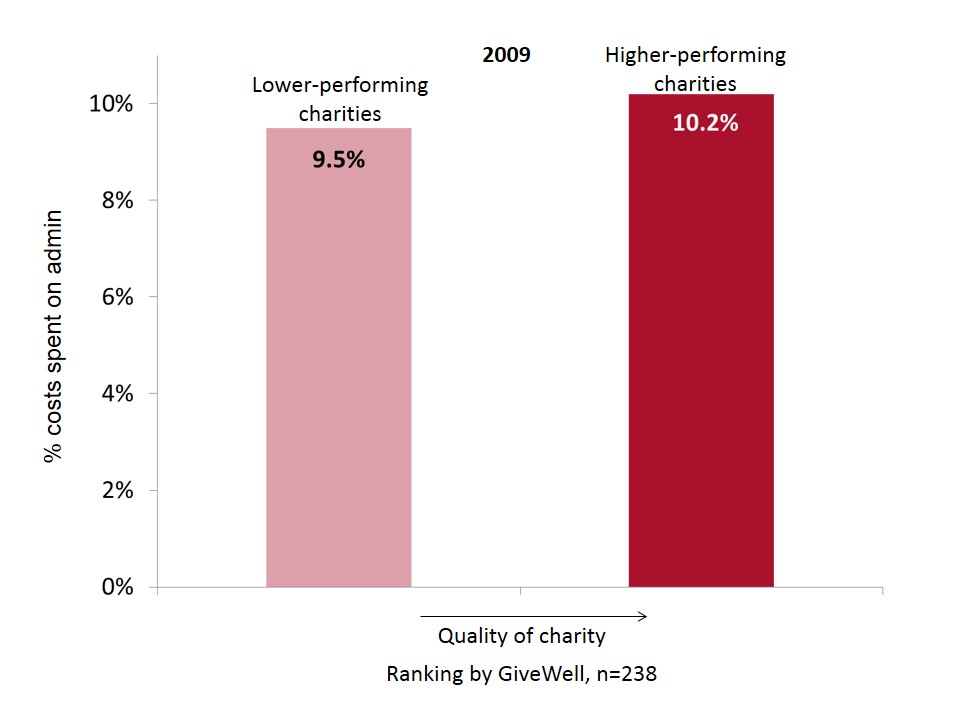
In 2009, GiveWell had four levels of ranking, and the pattern is even more pronounced if we use those:
 The conclusion is that low admin costs do not signal that a charity is good. They signal the converse. So it’s wrong of charities to parade their low admin costs, as we’ve argued here before. Rather better is looking at what the charity actually achieves.
Admin costs are discussed in detail in It Ain’t What You Give, and when we understand what’s included, we can understand the pattern these data show. ‘Admin’ includes systems for capturing learning, for improving, for reducing costs. It’s spending on those things which enables good performance. Scrimping on them is often a false economy.
Assessing a charity by its admin spend is like assessing a teacher on how much chalk they use, or assessing a doctor on how many drugs they prescribe: they’re easy measures but don’t relate to performance. As Einstein said: ‘Not everything that counts can be counted. Not everything that can be counted counts.’
This isn’t to say that there isn’t waste in charities. There is: masses, much of it avoidable, and good charities try to avoid it. But don’t expect to find it clearly labelled in the financial statements.
To be clear, we used all the GiveWell data which were available at the point that the analysis was done. We have stated the sample size on all graphs.
Why is this the case?
It’s discussed in detail in It Ain’t What You Give, which you can get here. Here’s a snippet:
Imagine a water charity which operates in several less developed countries to improve irrigation. If it’s run well, it will have a system for recording what works and what doesn’t in particular circumstances, and for sharing that learning between its various country offices. Now, should the costs of that system count as ‘administration’? On one hand, the system isn’t directly helping people: it probably involves databases and conference calls, rather than pipes and water. As a result, it may well be classified as ‘administration’ in a charity’s accounts. However, the system will reduce the charity’s costs and increase its effectiveness, and therefore certainly isn’t waste. Aha – in this case, money spent on administration increases performance.
Let’s consider finance costs. Perhaps the Finance Director purchases a better invoice-handling system. Same thing. That system should reduce work for finance staff by reducing processing times and/or mistakes, which frees up their time (and/or frees up money) to improve the quality and quantity of service to beneficiaries.
Let’s take a real example. Chance UK provides mentors for primary school children who are at risk of developing anti-social behaviour and possibly being permanently excluded from school (formerly called ‘being expelled’). The charity spent some money evaluating its work. It found that male mentors were best suited to children with behavioural difficulties, whereas children with emotional problems responded best to female mentors. Again, the money spent on that evaluation would normally count as ‘admin’, but for the children receiving support which has improved because of that insight, it was money well spent.
—
This material was re-released as a document in 2015, here. The data behind these graphs and analysis are all here. Press release from 2nd May 2013 is here.
—
Update
We tried to update this analysis in 2019, hoping that there might be new data that we could add. There weren’t really, and the method kind of broke. See here.
—
A ton more insight to inform your giving–>
Want advice on your giving (or your company’s giving)? Here’s how–>
What does good evidence of impact look like? Not like this–>


Thanks for posting this! While I certainly agree with the outcome I’m a little questionable on the methodology. In my mind nonprofits should be judged on the outcomes they create, which I’m certain that GiveWell considers but who knows the quality of the product they are looking at. There are a lot of bad impact reports out there.
Secondly, my mind immediately jumped to the question of standard errors. You’re reporting strictly averages here without any sense of scale (n value) or variance. There could actually be no statistical difference between the various groups.
I definitely believe that overhead is the absolute worst way of measuring the impact of a nonprofit but I’m not sure what your evidence here actually proves.
Good questions. The answer to both is that this approach is fully transparent, so you can see for yourself:
On outcomes, (i.e., the x axis) you can look at GiveWell’s analysis because they publish it all.
On admin costs (i.e., the y axis) you can look at the standard deviation (or anything else you like) because the figures are all in the xls posted here.
I’ve even pointed out that the n is small (which is, by the way, pretty rare for people in this sector to do!), though it’s bigger than zero which is the typical number of data points people have in discussions about admin costs!
Awesome! Thanks. I’ll definitely check out the data. Totally glad to see good people doing this work!
Hi caroline, where do I find what is included in the admin fees please?
Whilst I find this fairly easy to believe, a sceptical audience might be better persuaded by longitudinal data (though I realise that’s a bit more difficult) – viz: does the percentage spent on admin in year x predict output quality/impact/revenue/other metric in year x+3? My concern with the cross-sectional data is that reverse causality might be applying here – do charities that are struggling to produce impact, or perhaps who are new and thus haven’t got going, have less money and thus feel that they need to spend less on admin in percentage terms?
I realise of course that such an argument still wont convince some of those calling for admin spending caps, as there is a strong emotional argument there as well (‘I want every penny that I give to get to starving children in Africa…’). For an interesting parallel, see ‘The NHS is actually undermanaged – http://www.bbc.co.uk/news/health-22350811.
Good comment. Trust the doctors to get into the stats properly!
On the longtitudinal question, well, “it’s too early to tell”(!) GiveWell’s only been going ~four years, and it was the first to analyse charity quality in such detail. Over time, it’ll become older, obviously, so that analysis should be easier, though it’ll still be messy because their algorithm etc. is evolving, so it’s not a like-for-like comparison.
However, the charities they rate highly now are not new, which implies that the good ranking isn’t just the flush of youth – plus GW looks for a track-record of impact, which obviously new orgs don’t have.
The NHS example is *very* interesting relevant. And concurrent: published only 24 hours before this piece.
I’m completely unconvinced Caroline.
Percentage is not an amount. The 0.7% range for 2011 is meaningless. Using percentage instead of an actual amount does not prove more or less funds are spent, only a higher or lower percentage is spent. At what spending level does 0.7% percent become material – $100,000, $1,000,000? It might not appear on any organization’s budget. The correct wording appears to be “spend a greater percentage” rather than “spend more.” The data you present does not show any amounts whatsoever, nor do two columns of data show units.
For the two 2009 charts, how are you compressing Give Well’s four ranking levels into two? How does “not rated” become “lower-performing?” Should “not rated” be excluded since data provider Give Well says these organizations are not rated? Why do you use average instead of median? When the third chart warns “small samples sizes,” I expected many more samples than 2, 4, and 32. How do you study, and conclude, based on two samples?
I expected the spreadsheet you provide to be Give Well’s data but it shows “College of Law” is the author. Who is College of Law and what is the school’s relevance here?
And of course, correlation does not prove causation but yet you use one data point to label organizations as “good” and “less good.” I don’t think that is good.
William
Pingback: Charity overhead stats are useful, but not in the way you think | Humanosphere
Hi Caroline. Your argument makes perfect logical sense and the data you present is suggestive evidence for the conclusion. However, it isn’t statistically significant by normal standards. Even though there are 38 higher performing charities in 2009, the standard confidence interval on their average admin percentage is +/-2%, exceeding the 0.7% difference from other charities. The 2011 result is based on only 6 higher performing charities, and deleting any one of three of them eliminates the observed difference, so it’s clearly not robust. Miles’s argument about causality is also a serious issue. But please do keep making the point, which is perfectly sensible.
Cheers,
Mark
Hello Caroline,
Following Andrew’s remark, I think inferential statistics would be important to see whether these patterns are significant or not. Happily, thanks to you publishing your data online, I’ve been able to perform these statistics myself. Unhappily, the statistical analysis does not support the conclusions made.
For the 2011 data, I compared the means for recommended (in some form) versus not recommended charities, and did a T-test. This was not significant (P=0.938). Playing with unequal variances or parametric methods did not get a significant result.
For 2009 data, I compared the difference in mean admin cost between ‘recommended’ (in some form, from notable to gold), and unrecommended, and did a T-test on the differences of means. There was no significant difference in means (P = 0.492). Playing with unequal variances or non-parametric comparisons did not get a significant result either.
I also wondered if there could be a relationship between the *degree* of recommendation and admin costs as depicted in your third chart, and whether that was statistically significant. I firstly did one-way analysis of variance between the groups, and no significant difference of means were found (P = 0.492). I also had a go at correlating degree of recommendation with admin costs via non-parametric methods, and also with parametric methods giving a scale of not recommended = 0, notable = 1, etc. etc. these were also not significant (P=0.4ish for the nonparametric, P=0.238 for parametric methods). Unsurprisingly, regression gave the same story.
I’m not so tech-savvy to put the working up online (I think you could knock it together in an hour or so on a stats program), but I hope you’ll take my word for it. Given how keen we are about being evidence based, I think we should not put too much weight in numerically different results which do not have statistical significance.
Best wishes,
Gregory
P.S. Very happy to *email* stats & methods & output from SPSS to whoever is interested. gjlewis37 @ usual gmail email address. 🙂
William: Taking your comments in order:
1. Why did I use ‘percentage instead of an actual amount’? Because everybody else does. This are the terms in which the debate happens. It’s because it enables comparison between charities of different sizes (albeit a spurious metric, in my view, obviously). If you go to the ratings on Charity Navigator (e.g., here http://www.charitynavigator.org/index.cfm?bay=search.summary&orgid=12310) they’re all in percentage terms.
2. Compressing the four levels of GW’s 2009 rankings: they have charities they don’t recommend (the LHS column in graphs 2&3), and ones which they do. The ones which they do, the split into three categories. In graph 2, they’re treated as one block; in graph 3 they’re treated separately. This is also all clear in the spreadsheet.
3. ‘Why do you use average instead of median?’ I think you mean ‘mean’. We used that because it’s more accurate than median. People use median to exclude misleading outliers, which we don’t have here.
4. “Small samples sizes”: well, we say that because they’re small, and we make abundantly clear in the spreadsheet the precise number.
*Notice that until this point, the debates about charity admin costs have used zero data points*
5. ‘College of law’? I don’t know what you’re referring to, and can’t find it in the spreadsheet on this site.
_____________
Gregory & Mark:
Thanks for looking at this in so much detail. There’s a reason that these data are published here and not in Econometrica! However, to repeat, even small n is better than n=0 which is how these debates normally work.
Furthermore, even if we found zero correlation between admin spend & performance… that would be a significant step forwards, because people often say (and act as though) there is a correlation, a negative one (i.e., higher admin = lower performance).
Caroline:
I agree that some data is better than no data, and you are right to say the data provides no reason to suppose *low* overheads are associated with effectiveness, which is a popular (but unlikely to be correct) view.
Nonetheless, the claims you make in this article just aren’t statistically defensible. This analysis doesn’t “show that high performing charities spend more on admin costs than weaker ones do”. Rather “The average admin costs of Givewell recommended charities are slightly higher than those that are not, but this difference is well within the range expected by chance if, in fact, there was no association between admin costs and Givewell recommendation.”
Even if you’re a Bayesian who dislikes significance testing, the confirmation this data provides for the hypothesis you state is minute. It isn’t much less likely that this data is a false negative rather than a true positive. If a charity was touting its effectiveness with figures like these, we’d be pretty sceptical, and we should be similarly sceptical here.*
I think the right thing to say here is: “On analysis, there is no significant association between admin spending and givewell recommendation, and in fact givewell recommended charities have numerically higher admin costs than those who are not recommended.”
OK. Though that is kind of long for a headline 🙂
How much do top-rated charities such as AMF and SCI spend on admin…?
I might be wrong but I suspect the answer is “very little”.
It is arrogant (and premature) to state that this research “disproves” anything…
“Arrogant”? Well, let’s stick with facts rather than getting into value judgements.
The data for AMF and SCI are in the spreadsheet. AMF is high (from memory); SCI doesn’t report because it’s part of Imperial College London.
In approximate terms, the administration costs seem to have a baseline of about 10%. On these results, no one can avoid that component. After that, the best charities appear to put in a bit more effort into administration or research that optimises their operations at a cost of like a few percent. If this extra effort achieves more than a trivial improvement, it becomes money well spent. I would expect that work put into choosing and monitoring what is being delivered could achieve improvements in effectiveness that could be large multiples of this small cost component.
Pingback: Good charities spend more on administration than bad charities | whydev.org
Hi Caroline,
I commend the piece of work you’ve done, and hope that it leads to more work using data sets like Givewells. And thank you for immediately posting your method and dataset – this is better practice than two very distinguished (and now two very embarrased) professors of macroeconomics in recent weeks!
However I have to agree with other commenters above and Gregory’s additional stats: this does not amount to ‘evidence’ for your conclusion, and I hope that you might considering publishing an amendment or retraction.
Another issue that doesn’t seem to have been tested is possible other associations or confounds: what if quality is more strongly correlated with income/size (or lack of it), age of NGO, or sector/s of work?
I hope you might consider collaborating with some of the commenters above, as this is a very interesting and necessary area of research and (with facts in hand) advocacy.
Pingback: Why I’m delighted to join the advisory panel of Charity Navigator | Giving Evidence
Spent too much valuable admin time reading these comments!
Pingback: MPs should donate their payrise if they really don’t want it | Giving Evidence
Pingback: MPs should donate their payrise if they really don’t want it | Caroline Fiennes @carolinefiennes
Pingback: What’s your admin percentage? | Hiring Karma
Pingback: Overheating on Charity Overheads | Sector Blog
Pingback: NGO part 4 – Give your money well | Ugandapanda
I’m going to have to go with Gregory Lewis on this one. The data is just not sufficient to support the conclusions.
does anyone know where theirs a list from a to z- with the admins costs attached or beside the name- otherwise you have to open a thousand and read every one of them to know- ?
Pingback: Using behavioural science to put charities on a surer footing – Behavioural Insights Team | Public Sector Blogs
Pingback: What Charity Should You Give To? | CENSORED.TODAY
Pingback: Donors need to stop pressuring nonprofits to pinch pennies - Philanthropic Giving
Pingback: Practical donating part 4 – Bad metrics to choose a charity by (or: Why the admin ratio is bunk) – The ChangePath Blog
Pingback: Effective philanthropy – per cominciare - Italian Philanthropy Forum
Pingback: Administration costs can be good! – Giving is Great